
How to plot a free-energy surface from an MSM#
Goal#
Render a 2D free-energy surface on any pair of projected dimensions (typically the slowest TICA components) from a fitted Model, optionally overlaying the macrostate assignments so you can see which basin each macrostate occupies.
Minimal example#
model.plotFES(0, 1, temperature=360)
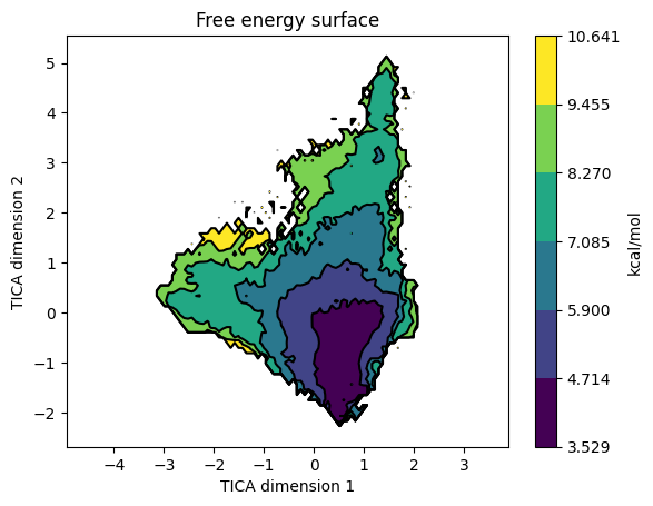
plotFES() bins the projected data along dimX and dimY and accumulates the stationary distribution there: each microstate marks the bins it visits and contributes its equilibrium population pi_i to those bins (so heavily-sampled but kinetically rare microstates are correctly down-weighted). The accumulated mass p is then converted to a free-energy surface via -kT log(p) and drawn as a filled contour map. Above is the FES from the villin folding tutorial on TIC1 / TIC2 - the deep central basin around (0.5, -0.5) is the folded state; the surrounding higher-energy contours are unfolded / partially-folded conformations.
Parameters that matter#
Parameter |
What it does |
|---|---|
|
Indices of the projected dimensions to use as axes. For a TICA-reduced model, |
|
Simulation temperature in K. Used in the |
|
|
|
Matplotlib colormaps. |
|
Number of contour levels in the FES. Default 7. |
|
Scatter-marker size when |
|
|
|
Pass a different |
Common variations#
Overlay macrostate assignments#
model.plotFES(0, 1, temperature=360, states=True)
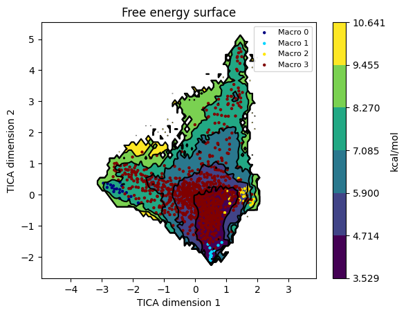
Each microstate is drawn as a small marker coloured by its macrostate. This is the right diagnostic for “did PCCA produce sensible basins?” - macrostates should cluster within the deep wells, not spray across the saddle regions.
Save the figure to disk without opening a window#
model.plotFES(0, 1, temperature=298, save="./fes.png", plot=False)
Useful in scripted pipelines where you want the PNG but don’t want to pop a matplotlib window.
Plot the FES on a different feature space than the model was built on#
from moleculekit.projections.metricrmsd import MetricRmsd
from moleculekit.projections.metricgyration import MetricGyration

# Build the model on contacts, but plot the FES on RMSD-to-native vs radius of gyration
ref = Molecule("crystal.pdb")
m = Metric(model.data.simlist)
m.set([
    MetricRmsd(ref, "protein and name CA"),
    MetricGyration("protein"),
])
alt_data = m.project()

model.plotFES(0, 1, temperature=298, data=alt_data)        # dim 0 = RMSD, dim 1 = Rg
Two distinct 1-D projections stacked through a single Metric give you a (n_frames, 2) feature array - exactly what plotFES(0, 1, ...) needs. data= must have the same simlist as the model (same number of frames, same ordering); only the per-frame feature values differ. Lets you keep a single Markov model while exploring its energy landscape in different coordinate systems.
Custom colour map and contour levels#
import matplotlib.pyplot as plt

model.plotFES(0, 1, temperature=298,
              fescmap=plt.cm.gray, levels=15)
More contour lines reveal finer basin substructure; greyscale is sometimes clearer in printed figures.
Post-process the figure#
fig, ax = model.plotFES(0, 1, temperature=298, plot=False, save=None)
ax.set_title("My system - 298 K free-energy surface")
ax.axhline(0, color="white", linewidth=0.5)
fig.savefig("./fes_annotated.png", dpi=300, bbox_inches="tight")
With both plot=False and save=None, plotFES returns the (fig, ax) pair instead of displaying. Hand back to matplotlib for any further customisation.
Gotchas#
The FES is computed from microstate populations, not raw frame populations. Sparse microstates (very few visits) contribute noisy bins - their free energies can look artificially high. Cluster with enough microstates that each one is hit by many frames before reading absolute energy values off the FES.
temperature=matters because the FES is in kcal/mol via-kT log(p). Use the production temperature - mixing 300 K and 360 K runs into one model and asking for onetemperaturemakes the y-axis numerically meaningless.Axis labels come from
data.descriptionif present, otherwise they’re genericDimension Nstrings. After TICA the projection description does carry useful labels (TIC1, TIC2, …) but custom projections often have empty descriptions.dimX, dimYmust be valid indices into the projected data. For a TICA-reduced model withtica.project(3), valid indices are 0, 1, 2.Don’t read kinetics off the FES. Basin depths tell you equilibrium populations; the transition timescales between them come from
plotTimescales()andKinetics. A shallow well can have a slow kinetic exit if the saddle is high.
See also#
How to interpret an implied-timescales plot - the upstream check on Markov lag time and macrostate count.
How to extract a representative structure per macrostate - turn a basin in the FES into actual coordinates.
Villin folding MSM - the source of the FES image shown above.
htmd.model.Model.plotFES()- API reference.